
MEDICARE
This project focuses on redesigning a hospital dashboard system for managing medical staff.
The goal was to simplify complex workflows,
provide clear real-time information, and create actionable tools that help doctors and nurses coordinate tasks efficiently.

About The Project
This project presents a modern redesign of a hospital staff management system dashboard.
The goal was to transform a complex and outdated interface into an intuitive tool that enables medical teams to quickly access critical information,
monitor hospital capacity, manage staff assignments, and act on real-time alerts - all within a single glance.
The Problem
In hospitals, medical teams need to access critical information quickly, coordinate tasks efficiently, and respond to emergencies in real time.
However, the large amount of data and fragmented workflows often make it difficult to get a clear overview and take immediate action.
The Goal
-
Simplifying the user experience - making critical information clear at a glance.
-
Streamlining workflows - fewer clicks, greater efficiency.
-
Tablet optimization - a practical tool for on-site use, not just desktop.
-
Supporting real - time decision making – alerts, KPIs, and quick actions.
Design Process
Competitor Analysis Conclusions
Things to avoid:
-
Information overload - overcrowded screens with text-heavy data that can’t be scanned quickly.
-
Too many clicks - simple actions requiring multiple screens.
-
Flat alerts - alerts without prioritization, making it unclear what’s urgent.
-
Old-fashioned layouts - outdated table-heavy designs instead of intuitive layouts.
-
Desktop-only mindset - systems not optimized for tablet or mobile use.
-
Hidden KPIs - key performance indicators buried deep in screens instead of highlighted upfront.
Things to implement:
-
One-glance dashboard - critical information visible at a glance.
-
Quick actions - ability to complete tasks directly from the dashboard .
-
Clear prioritization - distinct separation between critical, urgent, and informational alerts.
-
Modern visualization - use of cards, and concise graphs instead of endless tables.
-
Tablet-friendly design - optimized for tablets, touchscreens, and landscape mode.
-
Staff overview - visibility of who is on shift and their workload.


Targt Users
The System Is Designed For
Doctor
-
Name: Dr. James, 45
-
Role: Senior Physician in the Intensive Care Unit
-
Goals:
-
View the overall status of the department.
-
Access critical test results quickly.
-
-
Challenges:
-
Difficulty identifying priorities when the system shows too much data at once.
-
Delays in receiving lab and imaging results.
-
-
Needs:
-
Clear KPIs (critical patient status, bed occupancy).
-
Prioritized alerts organized by urgency.
-
Nurse
-
Name: Sarah, 32
-
Role: Head Nurse in the Internal Medicine Department
-
Goals:
-
Receive real-time alerts about patients requiring attention.
-
Manage daily tasks (medications, lab tests) quickly and efficiently.
-
-
Challenges:
-
Information overload when handling dozens of patients.
-
Having to switch between multiple screens to mark tasks as completed.
-
-
Needs:
-
A simple dashboard with immediate tasks and the ability to mark them as “done” with one click.
-
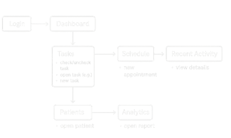
User Flow
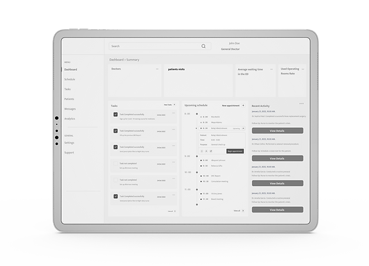
Mid Fidelity Wireframes


COLORS & TYPOGRAPHY
I used a consistent visual language: medical blues for actions/links, neutral backgrounds for calm readability, and semantic pastel chips (green/blue/red) for instant status scanning.
Final Design
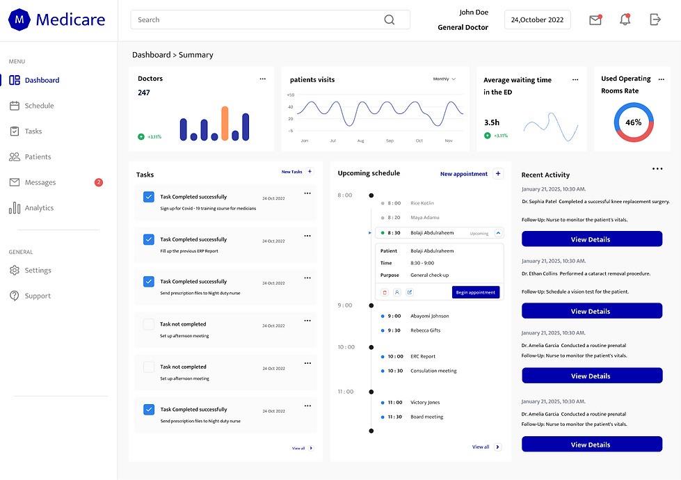
A management dashboard for medical teams that provides a single-glance view of hospital status - bed occupancy, ER load, department status,and key KPIs.
It includes prioritized alerts and quick actions directly on screen, plus tasks, a timeline, and a staff overview - optimized for landscape tablet use in the field.
Department patient table for quick scanning:
search + filters at the top, columns for Patient / Status / Attending MD / Room - Bed / Next Event / Wait Time,
with colored status chips for instant classification.
From each row you can perform quick actions (Open, Assign/Reassign, Done, Snooze, Bulk), and a tap opens a side panel with patient details (allergies/flags) without leaving the table.

Weekly schedule for a department/team: a week grid with days as columns and hours as rows, with color-coded appointment cards by category/status (Pending, visit type, time, location, patient).
Top-bar quick actions: Add, Search/Filter, Print, Help; each card supports open details, assign staff, and drag-and-drop to reschedule


